How to Layer Text in PowerPoint for a Bold Look
Share this Post
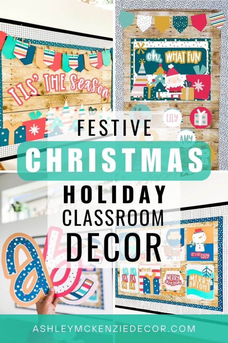
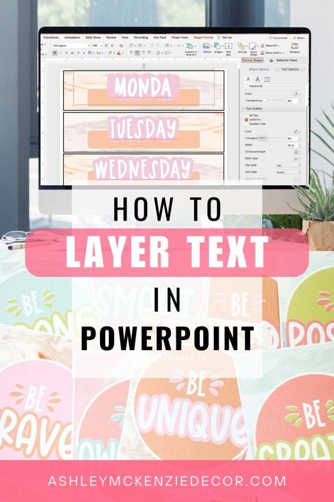
I’ve been creating classroom decor for over 10 years now. So I’ve had tons of opportunities to experiment with a variety of design tools and techniques. And in this post I’m sharing one of my absolute favorite design tips! I’ve been using this technique for several years now, and I get asked all the time about how to create this “bubbly” letters look. So, let’s walk through how to layer text in PowerPoint to create bold letters that pop on your classroom decor!
Use Text Layering When Editing Your Classroom Decor
You can use this “bubbly letters” design trick on any of your classroom resources! It’s especially useful when you’re placing text on top of a busy background image or digital paper that has a pattern. Sometimes a single layer of text just doesn’t standout enough against certain backdrops. But you can also use this tip to make your text pop spectacularly even on a plain background. Have fun with it!
Step 1: Open Your Resource in PowerPoint
Most editable classroom resources you purchase will be in PowerPoint format. This is true of the editable items in my shop as well. So you’ll want to make sure you have access to PowerPoint on your computer. Those using a Mac computer can also open these files and edit them using Keynote. However, the steps in this post are specific to PowerPoint.
First, open the resource you want to edit using PowerPoint. In this example, I’m going to create new labels for my rolling cart using the text editable file included in my decor bundle. If you’re using one of my classroom decor bundles, just look for the files that begin with “Editable” in the file name. They are all PowerPoint files, and you’ll use these files to add your own text on top of the original designs!
Step 2: Add Your Text and Choose Your Font
Next, add your text to the slide. There will likely already be at least one text box on the slide (with “Your text here” written in it). But if there isn’t, you can always insert a new text box if needed. Type the saying or word(s) you want to add to the slide.
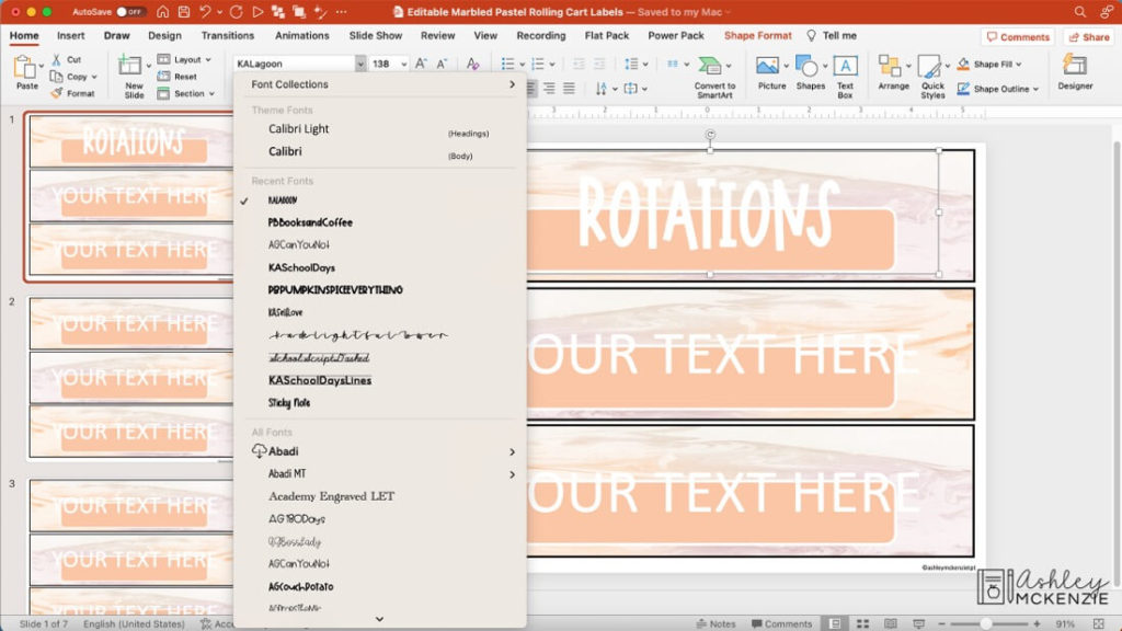
Then choose your font. If you want your edited items to match the look of the original resource, you can check the Tips and Tricks file included in my decor bundles. I include links to where you can purchase the custom fonts I use in the original designs from the font creators. Or, you can choose a font that you already have on your computer. It’s completely up to you!
Step 3: Layer Your Text Boxes
The next step is to layer your text boxes. My tip is to view the “Selection Pane” at this step. This tool allows you to see exactly which layer you have selected and makes it much easier to edit what you want to. In the “Home” tab, select “Arrange” on the right side, then click on “Selection Pane” in the dropdown menu.
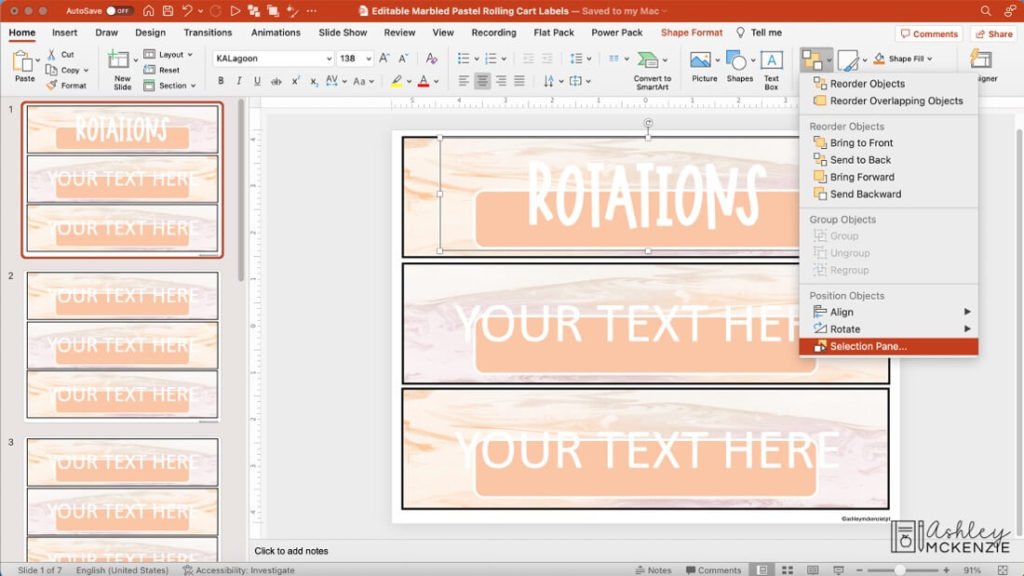
From the “Selection Pane” on the right, select the text box you just edited in Step 2. Then copy/paste to duplicate it. On a Mac, you can use the shortcut keys Command + c to copy, and Command + v to paste. On a PC, use Ctrl + c to copy and Ctrl + v to paste.
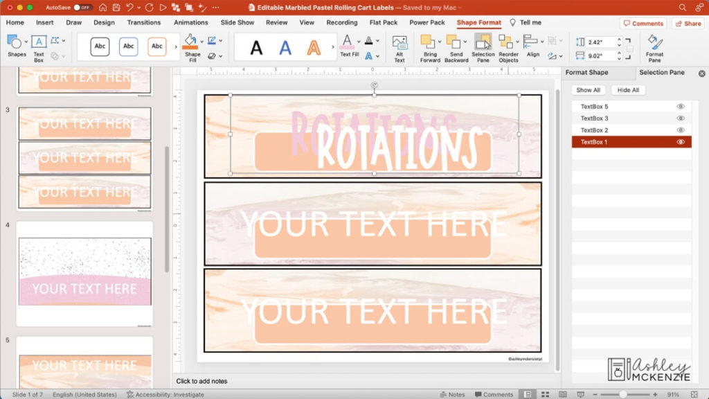
Don’t worry about lining up the text boxes just yet. But you will want to change the color of your text in at least one of the text boxes to be able to distinguish one from the other more easily. In my example, I’ve changed the color of the text box that’s on the lower layer to pink. And I’ve left the top text layer white. I love to use the eye dropper tool to pick up specific colors to match the text to the designs. (See step 4 in the linked blog post for tips on using the eye dropper tool.)
Step 4: Adjust the Width of the Text Outline
From the “Selection Pane,” ensure the lower layer text box is selected. Then access the “Format Pane.” To do this, select the “Shape Format” tab, and click on “Format Pane” on the far right. This opens up a side panel called “Format Shape.” Select “Text Options” and then “Text Outline.” Choose the “Solid Outline” option, and then adjust the width. In this design, I chose 35 pt (i.e. point) as the width, but you can adjust this up or down depending on the look you’re going for.
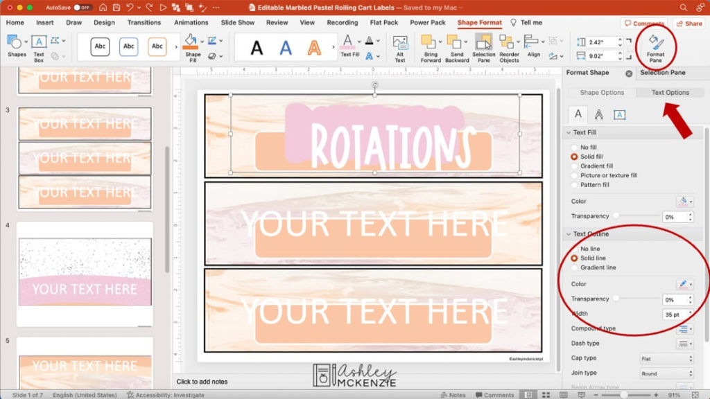
Finally, once you have your lower text layer set to the width you like, you can align the top text layer where you want it on top of the other one. You can center it as I did in this example, or offset it for a different look.
Step 5: Copy Your Text Layering Design to Create More Labels, etc.
Lastly, if you’re creating multiple labels, name tags, poster designs, etc. in the same document, you can easily copy the text format that you just created to create the other iterations you need. This is a great time saver! In my example, I’ve deleted the other two “Your text here” text boxes since I no longer need them, and it will clean things up for the next step.
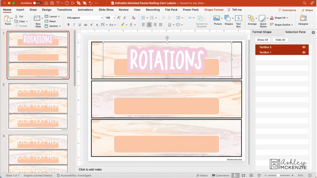
Using the “Selection Pane,” select both text boxes that you want to copy. Do this by clicking on one of the text boxes, then hold the Shift key, and select the second one. Then do copy/paste to duplicate both text boxes at the same time.
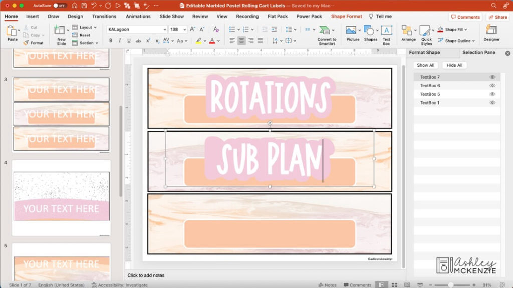
Using your mouse, move the newly copied text boxes where you want them on the slide. Then edit the text in each text box.
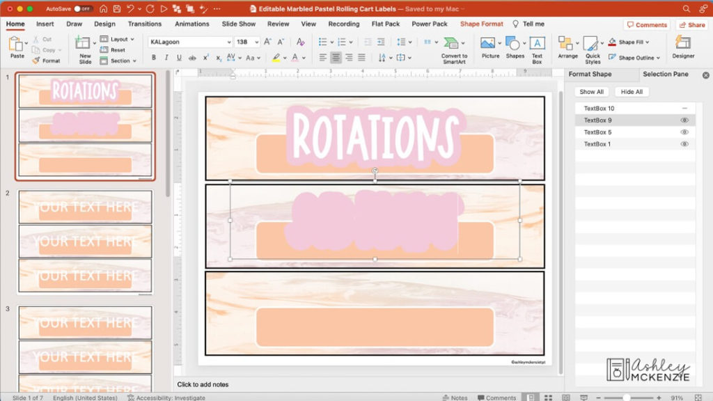
The easiest way to edit the text in the bottom layer text box is to hide the top layer, by clicking on the small eye icon for the top layer in the “Selection Pane.” This hides it so that you can edit the text in the lower text box. And then you can re-click on the hidden text box in the “Selection Pane” to unhide it.
More PowerPoint Tips
Do you want even more helpful PowerPoint tips? Check out these can’t miss how-tos for editing classroom decor. Like how to match colors using the eye dropper tool. And how to duplicate slides. If you’ve just purchased a classroom decor bundle, you’ll definitely want to check out these tips for editing your new decor!
Layer Text in PowerPoint to Make Your Sayings Pop
It may seem like a lot of steps the first time you go through it, but you’ll be a pro in no time! And your customized classroom decor will look amazing when you layer text in PowerPoint using these tips! I’d love to see how you use this technique in your classroom. Please tag me in your photos on Instagram @ashleymckenzietpt. Happy editing!


